By Flavie
When I was approached by Flavie Denelle, a talented portrait photographer that delves in other artistic fields, I understood early on that knowing Flavie personally would be a great advantage for this project, but also an added challenge.
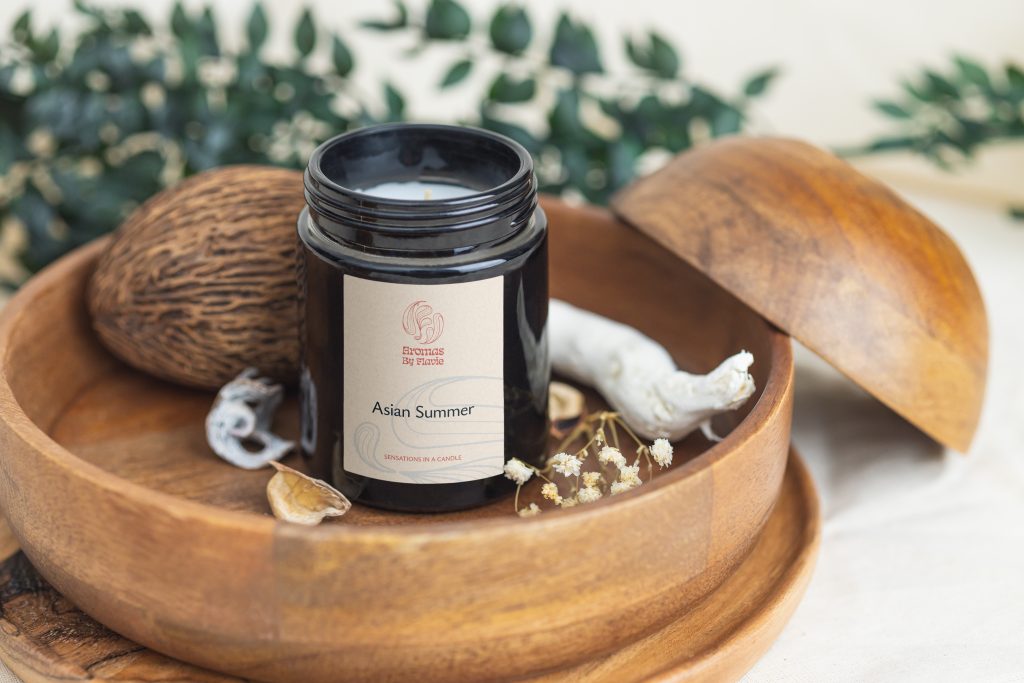
Her brief was clear: the By Flavie brand should be about her as a photographer, but should also be able to adapt to other of her passion projects, like her handmade jewellery. This two seemly unrelated fields of creation needed to be somehow separate from each other, and show also be prepared for any other project Flavie would develop in the future.
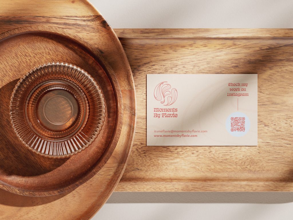
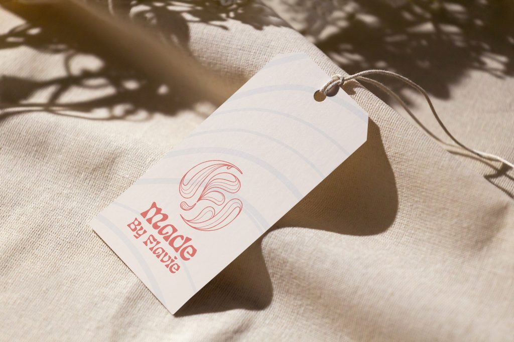
The creation of sub-brand prefixes was the solution: while Moments and Made are the elements that keep each product and service segmented, By Flavie is the central point that unifies the brand. This approach also makes sure the door is opened to other possible ranges, as demonstrated in the proof of concept presented in mock-ups for home fragrances and beauty products.
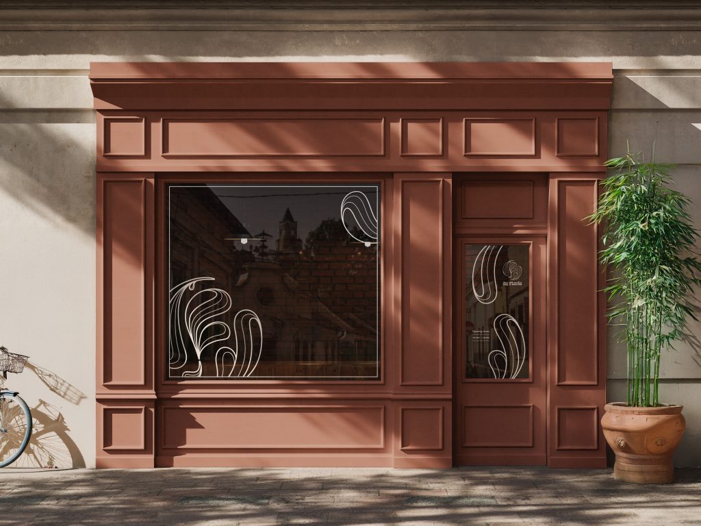
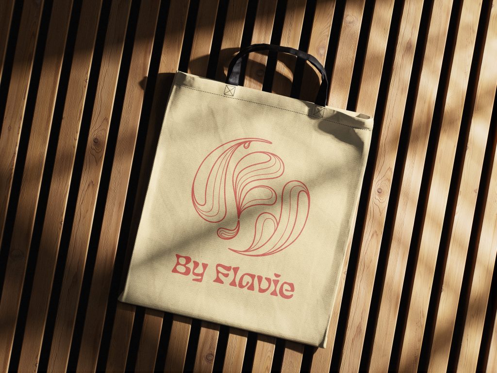
For the visual language, the main inspiration came from Flavie’s well know love of plants and nature. Organic, leaf or water-like shapes, were an element that needed to be present. The capital F and the rounded arrangement came from other traditionally very personal branding example: family crests and wax seals.
Finally, the typeface choice during the development stirred how the illustrated organic shapes looked. Its very expressive look and feel topped the artistic aesthetics that By Flavie is meant to be known for.